PANTONE 2020
- Feijó Design

- Dec 5, 2019
- 2 min read
Updated: Aug 22, 2023
Color is in everything! One of the first things we learn as a child is to tell them apart. Every year Pantone does research, studying trends and needs in the field of decoration, architecture and design to arrive at a color that will represent that year.

The 2020 color of the year is PANTONE 19-4052 Classic Blue.
Pantone reference to this color: "INSTILLING CALM, CONFIDENCE, AND CONNECTION, THIS ENDURING BLUE HUE HIGHLIGHTS OUR DESIRE FOR A DEPENDABLE AND STABLE FOUNDATION ON WHICH TO BUILD AS WE CROSS THE THRESHOLD INTO A NEW ERA"
I Liked it!!
Heller's study (2013) shows that Blue is the color preferred by 45% of humanity.
For me it will be a pleasure to work with this pantone and its variations, because I'm part of that 45%, hahahaha! But in order for us to work with this color, we first need to remember and understand how it works. Blue is a primary color, so it is present in several other colors such as green and purple. This color is quite versatile and easy to harmonize with others. This way we will have a wide palette to work with.
I can't skip the fact that it is also a cold color, reminiscent of calm and tranquility.
Here is one of my projects that I worked with the trousseau in this palette.


As you can see I never use blue at all, that would make a party a bit thick. The essential is always blend between flowers and the trousseau (tablecloth, table runner, charger, etc.). Note that, in this case, I chose for the pieces and trousseau in blue, leaving the flowers and tropical foliage as an option in warmer tones, such as orange, yellow and red.
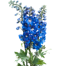
Below I listed some flowers that we managed to work in blue. Hope you like it.


Comments